Tuesday, 17 April 2012

Contrast

We seem to be in a time of contrast, peace and violence in the streets, flags and banners with messages of love, or hate, even at the same event. Clashes of ideas, opinions, movement and stillness. We hold our country in reverence, and then turn around and attack it. 

Historically, times of austerity bring out a Nationalism, we saw it in the Nazi's, we see it in the BNP, EDL and across europe the far right has increased it's following. 


We also have the economy, the "have and have nots". Austerity is a state the government puts the country in. It is a reaction to economic difficulties. It is harsh, unpopular and forces many people to make do and be more frugal. 


Again though, there is a contrast. It's not all doom and gloom. There is a revival in craft, home cooking, with people looking back to wartime rationing for inspiration. 

TV is full of shows looking back to these times, showing the way we lived then, the food we ate, the way we made do. 


Thee is probably more, but, i really want to get this idea of contrast into my typeface, I think it is such a massive thing at the moment that needs to feed into it.

Not Blackletter


http://alias.dj/blog/not-blackletter/

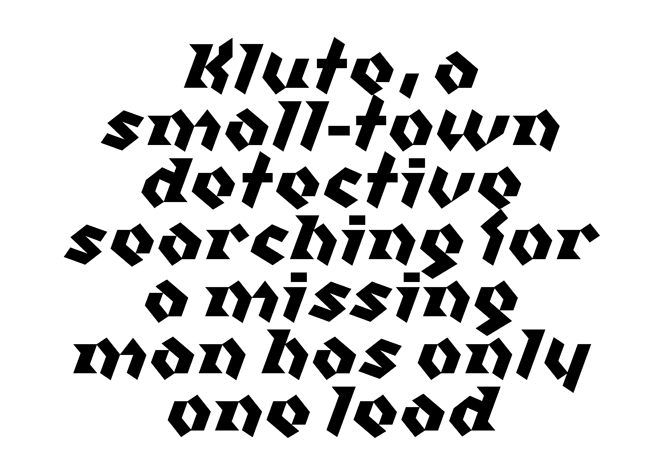
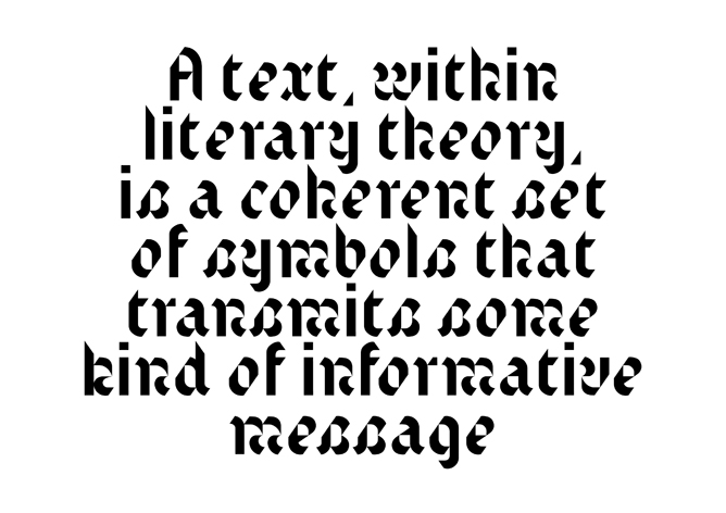
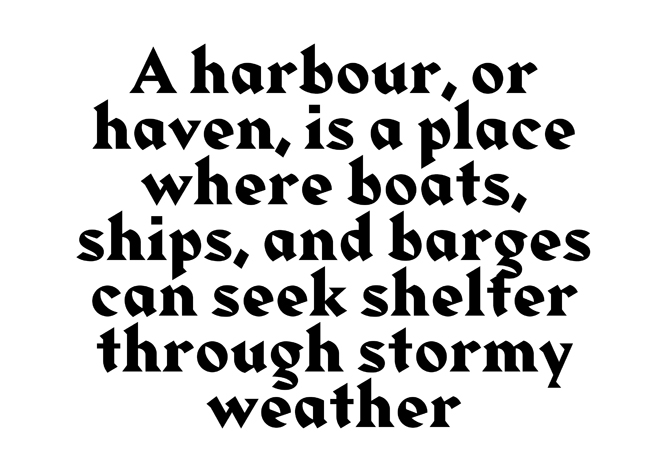
Great post about Blackletter typefaces and the Alias type foundries interpretation of these in Klute, Text and Harbour.


Sketches

I started out by drawing out the fonts I had chosen, to get a feel for them, how they flow their weights and features that make them unique. 
By doing this I began to identify features which I would like to explore, such as the high contrast in line weight and curves of Blackletter typefaces, the sharp angles of Albertus, the rigidity of Franklin and the roundness of Bayer Universal.

I started playing with a few ideas, exaggerating the shape of the internal curves or overshooting the x-height of letters, adding ascenders and descenders to letters, adding to the form but in a less decorative way. Making do with the shape that was there and exaggerating it.


I began mixing a solid, strong vertical with a more calligraphic rounded shapes. Taking from Blackletter and Franklin or Rotis, having not only a contrast in line weight, used to exaggerate the curve but also the contrast in movement of the line.


Monday, 16 April 2012

John Cleese on Creativity


Really interesting talk about creativity. The last two minutes basically describes where I work too!

Wednesday, 11 April 2012

Bastard

Bastard
Bastard is a modern interpretation of Blackletter typefaces designed by Jonathan Barnbrook in 1995. It uses modular shapes do build the letterforms that chair the same fractured make up of original blacklister typefaces whilst appearing modern.

Taken from Barnbrooks education website:

Q — You seem to put a lot of emphasis on the name of a typeface, why is this?

A — It is very important, in the past a typeface would take years so it was almost a life’s work. Therefore people would often use their surname. There was also the ‘Letraset’ school of naming which was to name after a visual pun to do with the typeface. Technology has changed the time taken and access for producing typefaces so it can be done be individuals on a much quicker timescale. I suppose I see it as a cross between naming a pop song and a painting. The name can be throwaway; last for a moment, but it can also have many different layers. The name ‘Bastard’ for instance I thought about a lot. The typeface is a blackletter (or gothic) font. It has strong associations with Fascism. It would have been silly to ignore this, even though blackletter has a large place in the history of typography, most people would associate it with the Nazis so it was a chance to almost ‘laugh’ at that. But if you bother to look further into the name, you will know that there is a 14–15th Century form of blackletter called ‘Bastarda’ or that putting the ‘wrong font’ in a piece of letterpress setting is called ‘bastard type’. All I am trying to say is that naming a font is incredibly important. There is a tension there, which can be played with.

Description:

Bastard is a blackletter font drawn with a contemporary eye. Historic forms have been reinterpreted using a set of modular parts and a new aesthetic appropriate to the contemporary technology it was produced on. In recent history these kinds of letterforms have been identified with the Nazis but blackletter type has been central to the development of typography for over five hundred years. The name 'Bastard' confronts these fascist associations but also refers to its historic basis.


Note: 8/5/2012
The main thing I have taken from this typeface is the modular way it is composed, reusing shapes to create each letter. I have done this to a lesser extent but it has enabled me to create my own typeface quicker, recycling parts and sort of creating in the spirit of Austerity!

Walbaum Fraktur

Walbaum Fraktur


Walbaum Fraktur was designed by Justus Erich Walbaum in the 1800s. It is a Blackletter font based on type found post 1200AD particularly in the area of Germany. It uses typically calligraphic strokes, high contrast between light and heavy stokes and a detached formation of the letters.

Fraktur (Latin for broken) typefaces had a renewed popularity just after the Great Depression with the National Socialist German Workers' Party, or Nazi's. They cultivated an aesthetic sense which was Nationalistic to the extreme, in support of their political campaign which focussed on the greatness of Germany, its old empire, and the alleged German humiliation in the Treaty of Versailles.


Note: 8/5/2012

This has been one of the main influences on my typeface, I have drawn a lot from the calligraphic, expressing strokes that give a hand drawn appeal that a more geometric font such as P22 Bayer Universal lacks. I think this gives the typeface a more human appeal, bringing a bit more emotion into the typeface rather than it be cold and purely functional. I was going to soften the contrast but, due to time and, so as to not water down a feature I thikn it important I have kept the string contrast between line weights which is another feature of Fraktur fonts.

P22 Bayer Universal

P22 Bayer Universal

P22 Bayer Universal is a font created from designs by Herbert Bayer by Denis and Richard Kegler in 1997. The Universal font is synonymous with the Bauhaus, of which Bayer was a student in Weimar. Bayer completed his final exam in 1925 and became head of Print and Advertising at the Dessau Bauhaus.

Hi experimental typeface Universal combined upper and lower case is a single character set, based on the Carolingian Minuscule (A calligraphic standard that meant all literate classes could easily recognise the latin alphabet and was used in Charlemagne's Empire between 800 and 1200. It developed into Blackletter and became obsolete). The text takes the concept of recognition and simplicity further, creating basic shapes for letter and abandoning different glyphs for upper and lower case.

The typeface was never cast into a font and existed only as designs until 1997.