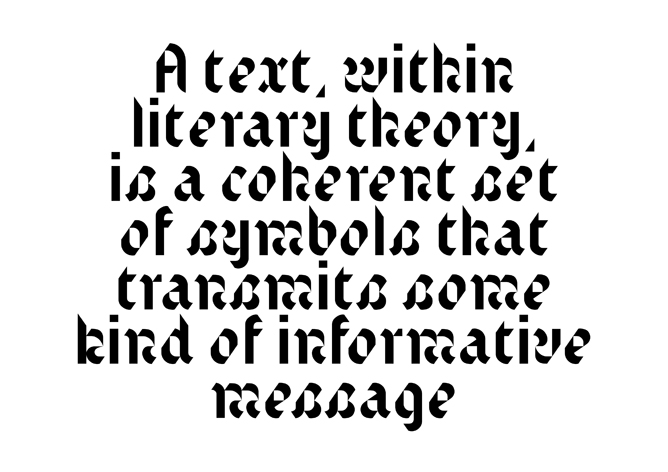
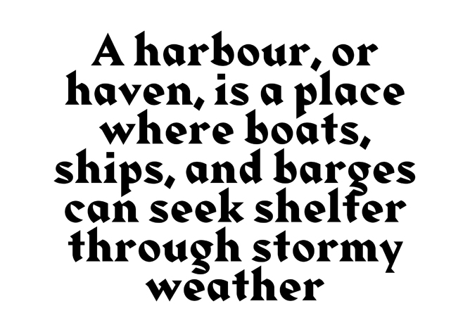
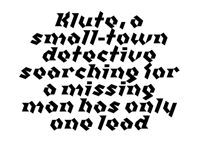
To display my typeface I shall be creating a type sample that will show the whole of the typeface so far. The basis of this type specimen will be a colour chosen from these period posters.
I think by using colour the tone can be set for the typeface. I shall also be linking elements to specific events such as the miners strikes to add weight to the typeface being called "Austerity".
Ideally I would use a pangram to show the typeface working but, due to time constraints and having to place each letter manually I have had to drop this.
A pangram is a sentence that uses each letter of the alphabet such as "The quick brown fox jumps over the lazy dog".
In giving my presentation I admittedly fell back on bad habits slightly and referred to my "font" rather than "typeface". I blame the computer age entirely.
So what is the difference?
Simple, a font is what you use, a typeface is what you see.
Whether it be the cast metal pieces or a digital file, those are fonts.
The typeface is the design of the letterforms on that file or block of metal.
The best analogy I have come across for this is songs and mp3/CD/Vinyl... "Paint it Black" is a great song...not a great mp3, that's just the delivery method.
So I have so far designed a typeface, the next step would be to create a font to deliver that to the world!
These are probably the first glimpses of my Austerity Typeface
The original drawings were extremely thin when I compared them to other regular weight fonts so I decided to beef up the thickness when I drew them in Illustrator.
In these first illustrator drawings the weight of the thin line remained the same. Although I want to use contrast I felt it was too much, and was having a detrimental effect on the legibility, so I started increasing the size of these thinner parts ever so slightly.
This has helped the curves look more pronounced and "there". Before they just faded to nothing.
We seem to be in a time of contrast, peace and violence in the streets, flags and banners with messages of love, or hate, even at the same event. Clashes of ideas, opinions, movement and stillness. We hold our country in reverence, and then turn around and attack it.
Historically, times of austerity bring out a Nationalism, we saw it in the Nazi's, we see it in the BNP, EDL and across europe the far right has increased it's following.
We also have the economy, the "have and have nots". Austerity is a state the government puts the country in. It is a reaction to economic difficulties. It is harsh, unpopular and forces many people to make do and be more frugal.
Again though, there is a contrast. It's not all doom and gloom. There is a revival in craft, home cooking, with people looking back to wartime rationing for inspiration.
TV is full of shows looking back to these times, showing the way we lived then, the food we ate, the way we made do.
Thee is probably more, but, i really want to get this idea of contrast into my typeface, I think it is such a massive thing at the moment that needs to feed into it.
I started out by drawing out the fonts I had chosen, to get a feel for them, how they flow their weights and features that make them unique.
By doing this I began to identify features which I would like to explore, such as the high contrast in line weight and curves of Blackletter typefaces, the sharp angles of Albertus, the rigidity of Franklin and the roundness of Bayer Universal.
I started playing with a few ideas, exaggerating the shape of the internal curves or overshooting the x-height of letters, adding ascenders and descenders to letters, adding to the form but in a less decorative way. Making do with the shape that was there and exaggerating it.
I began mixing a solid, strong vertical with a more calligraphic rounded shapes. Taking from Blackletter and Franklin or Rotis, having not only a contrast in line weight, used to exaggerate the curve but also the contrast in movement of the line.
Bastard is a modern interpretation of Blackletter typefaces designed by Jonathan Barnbrook in 1995. It uses modular shapes do build the letterforms that chair the same fractured make up of original blacklister typefaces whilst appearing modern.
Taken from Barnbrooks education website:
Q — You seem to put a lot of emphasis on the name of a typeface, why is this?
A — It is very important, in the past a typeface would take years so it was almost a life’s work. Therefore people would often use their surname. There was also the ‘Letraset’ school of naming which was to name after a visual pun to do with the typeface. Technology has changed the time taken and access for producing typefaces so it can be done be individuals on a much quicker timescale. I suppose I see it as a cross between naming a pop song and a painting. The name can be throwaway; last for a moment, but it can also have many different layers. The name ‘Bastard’ for instance I thought about a lot. The typeface is a blackletter (or gothic) font. It has strong associations with Fascism. It would have been silly to ignore this, even though blackletter has a large place in the history of typography, most people would associate it with the Nazis so it was a chance to almost ‘laugh’ at that. But if you bother to look further into the name, you will know that there is a 14–15th Century form of blackletter called ‘Bastarda’ or that putting the ‘wrong font’ in a piece of letterpress setting is called ‘bastard type’. All I am trying to say is that naming a font is incredibly important. There is a tension there, which can be played with.
Description:
Bastard is a blackletter font drawn with a contemporary eye. Historic forms have been reinterpreted using a set of modular parts and a new aesthetic appropriate to the contemporary technology it was produced on. In recent history these kinds of letterforms have been identified with the Nazis but blackletter type has been central to the development of typography for over five hundred years. The name 'Bastard' confronts these fascist associations but also refers to its historic basis.
Note: 8/5/2012
The main thing I have taken from this typeface is the modular way it is composed, reusing shapes to create each letter. I have done this to a lesser extent but it has enabled me to create my own typeface quicker, recycling parts and sort of creating in the spirit of Austerity!
Walbaum Fraktur was designed by Justus Erich Walbaum in the 1800s. It is a Blackletter font based on type found post 1200AD particularly in the area of Germany. It uses typically calligraphic strokes, high contrast between light and heavy stokes and a detached formation of the letters.
Fraktur (Latin for broken) typefaces had a renewed popularity just after the Great Depression with the National Socialist German Workers' Party, or Nazi's. They cultivated an aesthetic sense which was Nationalistic to the extreme, in support of their political campaign which focussed on the greatness of Germany, its old empire, and the alleged German humiliation in the Treaty of Versailles.
Note: 8/5/2012
This has been one of the main influences on my typeface, I have drawn a lot from the calligraphic, expressing strokes that give a hand drawn appeal that a more geometric font such as P22 Bayer Universal lacks. I think this gives the typeface a more human appeal, bringing a bit more emotion into the typeface rather than it be cold and purely functional. I was going to soften the contrast but, due to time and, so as to not water down a feature I thikn it important I have kept the string contrast between line weights which is another feature of Fraktur fonts.
P22 Bayer Universal is a font created from designs by Herbert Bayer by Denis and Richard Kegler in 1997. The Universal font is synonymous with the Bauhaus, of which Bayer was a student in Weimar. Bayer completed his final exam in 1925 and became head of Print and Advertising at the Dessau Bauhaus.
Hi experimental typeface Universal combined upper and lower case is a single character set, based on the Carolingian Minuscule (A calligraphic standard that meant all literate classes could easily recognise the latin alphabet and was used in Charlemagne's Empire between 800 and 1200. It developed into Blackletter and became obsolete). The text takes the concept of recognition and simplicity further, creating basic shapes for letter and abandoning different glyphs for upper and lower case.
The typeface was never cast into a font and existed only as designs until 1997.
Rotis was designed by the Otl Aicher in 1989. It's a comprehensive family group with Sans Serif, Semi Sans, Serif, and Semi Serif styles, for a total of 17 weights including italics. The four families have similar weights, heights and proportions; though the Sans is primarily monotone, the Semi Sans has swelling strokes, the Semi Serif has just a few serifs, and the Serif has serifs and strokes with mostly vertical axes.
The blending of sans with serif was almost revolutionary when Aicher first started working on the idea. Traditionalists felt that discarding serifs from some forms and giving unusual curves and edges to others might be something new, but not something better. But Rotis was based on those principles, and has proven itself not only highly legible, but also remarkably successful on a wide scale.
I first came across Rotis when I was looking for an alternative font for the Air & Ground logo.
The Semi Serif provided the right swooping serifs which was present in the existing logo. I explored these Semi/Demi serif fonts further and eventually settle on Ela Demiserif.
I really did not know where to even begin with designing a typeface.
When I asked Eric Spiekerman and Jonathan Barnbrook what software they use, Jonathan pointed me in the direction of a video which goes through the process of getting drawing into applications like Fontlab.
There is also a process guide on the FontSmith blog below.
I think realistically I will be looking to get the shapes for the typeface drawn for the end of this project, into a point where I can put them into FontLab and make them a workable font.
Note: 8/5/2012
Also found this article, a "What I've learned" by Gerry Leonidas
http://ilovetypography.com/2010/03/25/a-few-things-i’ve-learned-about-typeface-design/
Named after inventor and printer Benjamin Franklin, Franklin Gothic was created in 1902 by Morris Fuller Benton. Between 1902 and 1912 American Type Founders issued the first five faces: Franklin Gothic regular, condensed, extra condensed, italic and condensed shaded.
With the emergence of serif font popularity, Franklin Gothic largely fell out of favor until in 1952 when ATF introduced the Franklin Gothic Wide font, designed by John L. “Bud” Renshaw. Within a few more years they again added a new face with the Franklin Gothic Condensed Italic font by Whedan Davis. But the heyday for Franklin Gothic’s older gothic style was being eclipsed by the newer more sleek style of fonts like the Univers® and Helvetica® typeface families.
In the early 1980s International Typeface Corporation® began developing new versions of old metal typefaces and commissioned Victor Caruso under an ATF license to create four new weights of the font for the roman and italic faces: book, medium, demi and heavy and issued them in two designs: display and text. ITC continued to develop the family in various weights and styles, and produced versions in PostScript Type 1, TrueType and OpenType formats.
David Below of the Font Bureau approached ITC and began a collaboration in 2004 to rework Franklin Gothic for the digital age. The first phase of the redesign was completed in 2008. This new family was simply called ITC Franklin and has grown into a robust set of 48 different fonts!
No other typeface really compares with the constant revival Franklin Gothic has enjoyed. It has been prevalent during all the major periods of austerity which makes it perfect as a source of inspiration for my typeface!
Albertus was begun in 1932 by Berthold Wolpe at the encouragement of, again, Stanley Morison. Morison had seen an example of Wolpe's inscriptual lettering and commissioned him to design a typeface based upon the design he had liked so much.
Work continued on the typeface right up until 1940.
Note:
There is some lovely bits of this typeface where curves and angles meet, particularly on the "a". I have taken this into my typeface to fit in with the contrast them, particularly in the "f", "t" and "s".
Gill Sans is a Humanist Sans Serif typeface introduced in 1928. It was created by Sculptor and Calligrapher Eric Gill who worked on it through the 1930's. Gill meant to create, “Absolutely legible-to-the-last-degree letters, provide beauty of form to all printed communication, and to maintain the dignity of hand drawn letterforms.”
Unlike some Sans Serif typefaces, Gill Sans maintains a humanity and personality, adding more calligraphic stokes to the geometry of the letter forms.
The development of Times Roman (or Times New Roman depending on the foundry) was instigated by Stanley Morison in 1929 for The Times newspaper. He approached Victor Lardent, a designer with Monotype where Morison was typographic advisor to design a font for the newspaper that would be highly legible, appear larger than its predecessors and take up no more space. Morison and Lardent based their typeface on Plantin so as to satisfy many of the criteria provided by the newspaper.
The two worked on the project for over two years.
I have chosen this typeface because of the period it was developed in, it was begun and finished for use in The Times newspaper during the Great Depression period that effected both Britain and America. It has also become a staple of recent times, being used as the default typeface for Microsoft since 1992 in products such as Word.
The typeface is classed as Transitional Serif and was originally released by Monotype in 1931 in its commercial form.
Something has changed, I'm not exactly sure what, but something has definitely changed since the start of this course.
Before the weeks just sort of blended together into a much of just trying to get through. I wasn't enjoying design. It had become a chore, no value was placed on any kind of research or preparation. Things were needed last minute, were rushed and generally as good as I could manage.
Work is still like this.
But outside of work, I have been getting asked to do work left, right and centre, I'm getting involved with local arts ventures (the town is going for up to £3m over three years with Cannock council, the big thing seems to be something similar too the Creative Village on the campus).
I've been asked for band logos, websites, branding for Tamworth Booktown Project (I really want to use Mason again, but, I kind of think I should let go slightly and try something else), I'm...having to really think about how much time I have so I can do some of these things and project work!
I'm talking about design with passion again.
I've started putting a framework together for my own website, so I can fill it with wonderful things I hope I will create on this course.
I keep getting the thing Jackie said come into my head, about if your not happy somewhere then leave. Although I don't think it's quite that simple, its feeling more and more possible.
I am finding enormous pleasure in just looking at typefaces.
I didn't think I would get to see this, being on a Monday evening, short notice and being sold out, until I saw it was a live webcast too!
The panel consisted of Neville Brody, Jon Wozencroft, Jonathan Barnbrook (I'm mentioning him again), Teal Triggs and was compered by Adrian Shaughnessy.
Each gave a short presentation on the role of type and visual language.
Notes below.
What was interesting about the whole lecture was the idea that type has become "conservative", "safe" and "colonised by the corporate world". The typography that people encounter day to day is quite plain. This wonderfully comes into my project for Visual Austerity!
Interesting ideas that can feed into my work.
Jonathan Barnbrook "The tension of legibility, recognisable letterforms, religion and politics"
Neville Brody "Experimental typefaces, illegibility, freedom from constraints"
Jon Wozencroft "Poetry of form, romanticism, colouring a message, break out of digital"
Adrian Shaughnessy (on Herb Loobalin) "Amplify the message"
The World is currently in a spot of economic bother, whole countries in debt and financial strain on their population. This isn’t the first time times have been hard there are many different periods when people have had to make do on very little. From the Depression in the 30’s to our recent predicament.
The Guardian article “From Hockney to Downton Abbey: have our cultural tastes gone conservative?” by Jonathan Jones (The Guardian 2012) asks whether British culture has gone conservative, with period dramas, cookery and craft programmes and David Hockney’s traditional landscapes enjoying a resurgence in popularity, while Eye Magazine was hailing a “golden age of type”, with many Foundries revisiting their classic fonts in the blog post “Type Tuesday: Quirky ligatures and swash characters: serifs are the new sans.” by Catherin Dixon (Eye Magazine Blog 2012). Both of these articles cite a looking back, possibly to times of comfort during times of austerity. Has this always been the case? What is it that we do exactly in times of austerity, is it as simple as looking back to “the good old days” or is there something more? Is there a certain visual language for what we do?
To get an accurate picture of what the visuals of austerity may be will involve looking across an extremely broad timescale. This should make any patterns more apparent.
Catherin Dixon Eye Magazine Blog(2012). Type Tuesday: Quirky ligatures and swash characters: serifs are the new sans. [Online] January 23rd 2012. Available from: blog.eyemagazine.com http://blog.eyemagazine.com/?p=4072 [Accessed: 23rd January 2012].
I have recently been invited to be a member of the Tamworth Live Music Committee. Many moons ago we used to have a free festival, with local bands who had gotten to the final of the local Battle of the Bands. It was all very good and then, for some reason it stopped. Most people who went to Freefest will tell you with great pride about bands such as Spiral Eye, Wolfsbane (who did quite well), Blaze Bailey (who did even better, singing with Iron Maiden for a bit) and Julian Cope, member of The Teardrop Explodes and apparently quite the expert on Britain's stone circles.
Anyway, the committee aims to bring back our free festival, promote local gigs or local bands in gigs elsewhere.
I, along with a few other people, have volunteered to produce artwork for the logo.
The rough brief for this was something that will have cross genre appeal, was modern, but had a link with Tamworth's past (both musically and historically). I chose a font designed by Jonathan Barnbrook (I may have mentioned him, once or twice) which was a modern Sans Serif, but incorporating Blackletter elements linking with both the Medieval past historically and the Metal music of Tamworth's musical past.
Tamworth Live logotype - font used Mason Sans Alternative Bold
This is then coupled with a colour scheme generated from a Teardrop Explodes album cover "Wilder".
This then produces a mixture of colours that can be used singularly or in pairs depending on the artwork requirements.
Shading is added using a woodblock style line effect and a companion colour.
As well as the logotype I have been working on a website where we can promote and manage events. This uses a wordpress template and plug ins to make it as easy as possibly for me to develop and for the Committee to use.
"Challenging designers to follow their passions and choose their own paths. One day at a time."
"Each day, for the next 100 days we will post a bit of inspiration about design entrepreneurs and their projects. Follow along with us as we dream, discover, and get inspired by designers who find a way to turn personal passions into fulfilling careers. It’s an exciting time to be designers, and we are excited to be alive."
There is some really wonderful stuff here, it's quite short so ideal for a quick break from work to read something inspiring/interesting.
This is nonsense. Of course you should meet your heroes. I have mentioned before my admiration for Jonathan Barnbrook, every so often we have a brief exchange on Twitter, and each time I learn something.
Previously it has been about copywriting digital work (a company he sold fonts through offered refunds...on digital items that had already been downloaded) and more recently the software he uses, I also asked Erik Spiekerman. Both replied with pretty much the same software that hopefully I shall be using for my project.
These exchanges are only brief with the 140 characters Twitter offers but, thats all you really need.
I have also had the pleasure of talking to David Pearson, Tim Quinn, Curtis Jobling and Kim Hiorthoy, all were incredibly inspirational.
The other week we did a fantastic exercise to spark our creativity. We were given a short amount of time to generate as many ideas as possible around a given theme such as "Anti Royalist souvenirs for the Diamond Jubilee" and "uses for old tin cans".
The main aim for this exercise was not necessarily to produce good ideas, simply to loosen the ability to generate them. Below are some of the ideas generated and their topics.
Alternative uses for tin cans
Alternative souvenirs for anti Royalists
I found this exercise extremely useful, I all to often get caught up in wondering if an idea is good enough rather than getting on with having ideas.
I think it is important just to keep doing stuff, there are times when work can dry up slightly and motivation can be lost. I find keeping momentum when there is less work a real struggle. I have decided to start an ongoing project/exercise that I can do to maintain this momentum and keep the flow of ideas.
There is a wonderful project by Johnny Selman www.bbcx365.com where he is interpreting news events as posters for a year, aiming to make the American public more aware of world events.
I would like to do a similar project, taking headlines and generating ideas from them. No set rules of how I can interpret them, the aim would not be to build up pieces of work, simply to generate ideas like the exercise I have mentioned. Some of these ideas or articles may then lead onto other thing as a way of exercising my creativity and ideas generation.
I am a really big fan of A List Apart. There are some brilliant articles on there that, although mostly on web design can be applicable to most creative practices. Two articles that really stand out, in terms of these exercises are, "Staying Motivated" and "Reigniting Your Creative Spark".
It makes sense to surround yourself with like minded people, professionally and personally. They can help you grow, learn things and be better at what you do. There are many organisations around for Graphic Design, some act as a hub of talks, events, competitions and discounts while a few others offer a form of accreditation that can help bolster you as a creative individual or company.
D&AD - Design and Art Direction
Price
Awarded Member — £100.00 Member — £100.00 New Creative — £35.00
Benefits
2 free President’s Lecture tickets per year, and discounts thereafter
Free tickets for Sharp’ners (Lively pub events, for Members and friends to share opinions and exchange ideas)
Invitations to Member events such as D&AD Awards judging tours and the Annual launch
Showcase yourself and your work with your online profile. (Awarded members only)
Previews of filmed President’s Lectures and Sharp’ners. Spend an hour or so with the greats - Terry Jones, Bob Gill and company. Members get to watch them first
Exclusive online content and opinion pieces
Download high res files from D&AD’s huge online winners Archive
Shape the future by casting your vote on the members of the D&AD Executive Committee
Take the opportunity to buy the Limited Edition D&AD Annual
Your name immortalised in print in the D&AD Annual
The discounts
5-10% off Apple products
15% off howies clothing
Up to 50% off magazines such as Creative Review and Wallpaper
20% off publications from publishers such as Taschen and Phaidon
10% off D&AD’s creative professional development programme – Workout
20% off your D&AD Awards Night ticket
15% off studio materials from London Graphic Centre
2 for 1 on tickets for the Barbican, Design Museum and V&A and selected shows at The Lowry, 20% off exhibitions at Tate Liverpool
Leading Creatives talk about what D&AD means to them.
ISTD - International Society of Typographic Designers
Admission
Membership by Application
Candidates for membership will normally be required to support their application by submitting their CV with between six and ten examples of their typographic design work, including background information on one item. Design concept, typographic competence, creativity, scope and presentation are all taken into account.
Price
Member — £100.00
Benefits
Professional Recognition
International Society
Views from Assessors and Society members on the ISTD Student assessment in 2011
AIGA - American Institute of Graphic Arts
Price
Member — $230.00 Member 4yrs + Experience — $315.00
Benefits
Access to Live webinars
AIGA Jobs
AIGA Member Gallery
Design Business and Ethis Publication
AIGA Designer Directory
The discounts
Discounted Apple products
Discounted Shutterstock
Discounted Adobe products
Conferences and Events
The Association of Professional Design Firms Discounted services
Print on Demand services at Blurb
Rockport Publishers events and discounts
What AIGA is and what it has to offer
TDC - Type Directors Club
Price
Member outside USA — $190
Benefits
Publication in Type Directors Annual "Typography"
Access to TDC Archive
The discounts
Discounted Entry to competitions
Discounted Fees for Events
Icograda - International Council of Graphic design Associations
Price
Mainly Company Based
Individual Zone A - $120
Zone B - $90
Zone C - $60
Benefits
Icograda General Assembly
Best Practice Papers
Networking
Icograda Design Weeks and Regional Meetings
Programmes and Activities
Member Toolkit
CSD - Chartered Society of Designers
Price
Associate (Assoc.CSD) - £100
Member (MCSD) - £180
Fellow (FCSD) - £264
Applicants are required to demonstrate their competence and that they are suitably qualified to be awarded a particular category of membership reflecting the stage in their career development.
Member 4yrs + Experience — $315.00
Benefits
Associate Membership includes
Use of the affix Assoc.CSD after your name
Discounts on CPD training modules
An Associate class membership certificate
Discounts on CSD events
Access to the members pages of the CSD website
Membership of Design Pool and Design Mine
Access to available professional services
Regional networking group access
Access to online fora
Access to available professional information & publications in CSD online Library
Membership (MCSD) includes
Use of the affix MCSD™.
A MCSD membership certificate.
Access to the members pages of the CSD website
Membership of Design Pool and Design Mine
Your own online profile and portfolio
Listing on 'Find a Designer'
Eligibility to vote at the Society's AGM.
Discounts on CPD training modules.
Discounts on CSD events.
Access to available professional services.
Professional advice and initial consultation with advisors.
Regional networking.
Access to available professional information & publications.
Criteria for Fellowship of CSD
The basic criteria for achieving FCSD:
Existing full membership of CSD.
In addition:
In order to award Fellowship, the assessors will be looking for you to demonstrate:
exceptional professional practice skills
a high degree of creativity
demonstrable management and business understanding.
You will also be expected to have made a significant contribution in 3 key areas:
to the design profession
to your own professional life in design
to the Society
Fellowship (FCSD) membership includes
Use of the affix FCSD™.
A FCSD membership certificate.
Eligibility to vote at the Society's AGM.
Access to the members pages of the CSD website
Membership of Design Pool and Design Mine
Your own online profile and portfolio
Listing on 'Find a Designer'
Discounts on CPD training modules.
Discounts on CSD events.
Access to available professional services.
Professional advice and initial consultation with advisors.
Regional networking.
Access to available professional information & publications.
Invitations to Fellowship only events.
Chief Executive talks about CSD and what it has to offer
The Typographic Circle
Price
Individual £30 Student (current full-time student or graduate within the last year*) £15 Company/College £125
Benefits
Advance email alerts and booking for upcoming events Access to members-only events Discounts with selected sponsors Discounted tickets for our events: £10 per ticket (saving £5 on a full-price ticket) A free copy of the award-winning Circular magazine
Company/college members also:
Are able to reserve up to ten places at events Are able to receive up to ten discounted tickets at events for their members Receive three members cards for designated staff Receive an extra two studio copies of the award-winning Circular magazine
Thoughts
D&AD has always been "the one" for creative professionals. They celebrate good work, provide talks and events and are a large active body within the design world. Not just Graphic Design either, all forms of creativity. This is really appealing, and they offer a lot in the way of discounts and entry to events and shows.
There is also the ISTD, which is internationally held in high regard for high standards and quality, offering nothing in the way of discounts or perks you would get but, making up for this with the accreditation and "seal of approval" they offer to professional practice.
AIGA trees the same vain as D&AD, mainly focussing on America although they are expanding worldwide. The only real advantage I can see to becoming a member of this is if I was going to be going over to America to work...and I do like the idea of California!
CSD for me is a strange one. They are very much a professional, business organisation from what I can tell, but they don't strike me as particularly inspiring. This sort of organisation seems more for clients than designers, offering a reassurance that a designers practice is to a high standard.
Icograda is one for the future. Should I ever achieve my dream of owning a studio then, this would be worth becoming a member. They offer much in the way of business advice and help (as do CSD) and again, its a mark of approval for a prospective client.
The Typographic Circle is the cheapest of the organisations, offering discounted access to events, and with sponsors. Possibly worth it just for the early booking on events.
I am not really sure how much accreditation is necessary within Graphic Design, they are rarely mentioned past winning a D&AD pencil. I would be interested to hear from people within the industry what the view is on some of these organisations, whether they are worth joining, why they aren't mentioned and what they are members of.
For me, my immediate thoughts are D&AD and ISTD, I feel more points of view on the others would be beneficial.