Thursday, 10 May 2012

Presenting the Typeface

To display my typeface I shall be creating a type sample that will show the whole of the typeface so far. The basis of this type specimen will be a colour chosen from these period posters.


I think by using colour the tone can be set for the typeface. I shall also be linking elements to specific events such as the miners strikes to add weight to the typeface being called "Austerity".

Ideally I would use a pangram to show the typeface working but, due to time constraints and having to place each letter manually I have had to drop this.
A pangram is a sentence that uses each letter of the alphabet such as "The quick brown fox jumps over the lazy dog".

Tuesday, 8 May 2012

Typeface or font?

In giving my presentation I admittedly fell back on bad habits slightly and referred to my "font" rather than "typeface". I blame the computer age entirely.

So what is the difference?

Simple, a font is what you use, a typeface is what you see.

Whether it be the cast metal pieces or a digital file, those are fonts.

The typeface is the design of the letterforms on that file or block of metal.

The best analogy I have come across for this is songs and mp3/CD/Vinyl... "Paint it Black" is a great song...not a great mp3, that's just the delivery method.

So I have so far designed a typeface, the next step would be to create a font to deliver that to the world!

http://www.typophile.com/node/14701#comment-84393

http://fontfeed.com/archives/font-or-typeface/

http://typographica.org/features/our-favorite-typefaces-of-2007/

Tuesday, 17 April 2012

Austerity Typeface

These are probably the first glimpses of my Austerity Typeface

The original drawings were extremely thin when I compared them to other regular weight fonts so I decided to beef up the thickness when I drew them in Illustrator.
 In these first illustrator drawings the weight of the thin line remained the same. Although I want to use contrast I felt it was too much, and was having a detrimental effect on the legibility, so I started increasing the size of these thinner parts ever so slightly.

This has helped the curves look more pronounced and "there". Before they just faded to nothing. 

Contrast

We seem to be in a time of contrast, peace and violence in the streets, flags and banners with messages of love, or hate, even at the same event. Clashes of ideas, opinions, movement and stillness. We hold our country in reverence, and then turn around and attack it. 

Historically, times of austerity bring out a Nationalism, we saw it in the Nazi's, we see it in the BNP, EDL and across europe the far right has increased it's following. 


We also have the economy, the "have and have nots". Austerity is a state the government puts the country in. It is a reaction to economic difficulties. It is harsh, unpopular and forces many people to make do and be more frugal. 


Again though, there is a contrast. It's not all doom and gloom. There is a revival in craft, home cooking, with people looking back to wartime rationing for inspiration. 

TV is full of shows looking back to these times, showing the way we lived then, the food we ate, the way we made do. 


Thee is probably more, but, i really want to get this idea of contrast into my typeface, I think it is such a massive thing at the moment that needs to feed into it.


Not Blackletter


http://alias.dj/blog/not-blackletter/

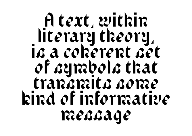
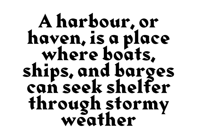
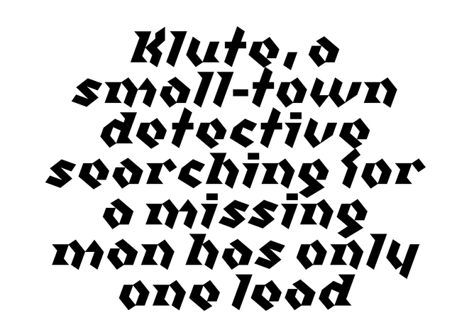
Great post about Blackletter typefaces and the Alias type foundries interpretation of these in Klute, Text and Harbour.


Sketches

I started out by drawing out the fonts I had chosen, to get a feel for them, how they flow their weights and features that make them unique. 
By doing this I began to identify features which I would like to explore, such as the high contrast in line weight and curves of Blackletter typefaces, the sharp angles of Albertus, the rigidity of Franklin and the roundness of Bayer Universal.

I started playing with a few ideas, exaggerating the shape of the internal curves or overshooting the x-height of letters, adding ascenders and descenders to letters, adding to the form but in a less decorative way. Making do with the shape that was there and exaggerating it.


I began mixing a solid, strong vertical with a more calligraphic rounded shapes. Taking from Blackletter and Franklin or Rotis, having not only a contrast in line weight, used to exaggerate the curve but also the contrast in movement of the line.


Monday, 16 April 2012

John Cleese on Creativity


Really interesting talk about creativity. The last two minutes basically describes where I work too!